Thoughts on Kickstarter #3 – What I look for in the KS page part 2

In my last post, I wrote about the importance of the Kickstarter project image. A beautiful photograph or excellent rendering makes me want to learn more about the project. Now that I have clicked on the project and landed on the project’s main page, I am looking for specific details about the project in a very short amount of time. Let’s see what is important about the project page!

Second topic: 5 most important things in the project page

1. Game description

The very first thing I see on the page should be a brief description of what the project is about. Since I am focusing on the Kickstarter projects for tabletop games, I want a 2 to 3 sentence description of what the game is about. This should include the type of the game (worker placement game, tile-laying game, trick-taking game, etc.), the theme (historic, sci-fi, adventure, Lovecraft, cat, etc.), and some highlights (2-player only game, solo mode, support many players, legacy, etc.). Right underneath the text, there should be some artwork, typically a layout of the components as the game is played, or the game cover, or some game pieces (perhaps miniatures). After reading this part, I should have a decent understanding of whether the game is interesting to me, or it is not for me. If I am confused then typically I lose interest and flag it as not for me.

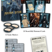
2. What’s in the box

After learning that the game sounds interesting, I then want to see what I am getting. If there are multiple versions of the game (with and without extra miniatures, or standard and deluxe version), then it should show the components for the version that most people would be interested in. To me, the purpose of this section is to figure out what I am getting for the money I am spending and to see if I like the art style and illustrations. There has been a lot of games where I thought the game looked interesting but I walked away because I didn’t like the art style or vice versa where I was lukewarm on the descriptions but I loved the artwork and bought the game. This and the previous section is sort of like the box back. I grabbed the game off the shelf because the box front (analogous to the project image) looked interesting, and now I am reading the box back.

What’s in the box image from Arkham Ritual

3. How to play

If I make it to this section, then I am pretty close to being bought. The game sounds interesting and I like the style. Now, I want to really learn how the game works and whether the game mechanics are interesting. I have seen great how to play sections using animated GIFs. The goal of this section isn’t to teach the entire rule of the game, but just to give a high-level overview of what players will be doing. It should have no more than 5 steps, plus maybe a scoring/end of the game section. At the end of the section, I’d like to see a link to a finished (or very close to being finished) rule book. I instantly lose my interest when the rule book link is to an unfinished word document. I’ve also seen a great tutorial video from people like Meeple University and The Rules Girl. These are wonderful as they can teach you the game in less than 5 minutes.

4. Review/Preview Video/Blog

It is always nice to see what other people think about the game and what they liked. I don’t need to see a lot, but not having one, or having “coming soon” is a big negative for me. As for video versus blogs, I like it when there are both types as sometimes I am in a hurry and I don’t want to watch a video. Having a quick summary or a quote from the review is always nice to have. I don’t care too much on how big of a follower the reviewer has as long as the video or the writing is clean and looks professional. I will consider writing about my experiences with reviews and reviewers in a future blog post.

5. Shipping

This is where the bad news is for the backers. I definitely prefer shipping to be included as a part of the campaign. I have done it both ways as a creator and I fully understand the benefit of asking for shipping after the campaign. But I feel that this is a disservice to the backers regardless of how small the shipping cost is. I have turned away from backing the project because not knowing the exact shipping cost ahead of time was too stressful. The project must be really appealing for me to swallow that fear. Having the shipping included in the project and indicating the shipping cost in a table format is, in my opinion, a must-have.

Bonus: Stretch Goals

I put this in here because I tend to not care too much about stretch goals when making my decisions whether or not to back the project. Yes, I like getting more for my buck, but having a ton of stretch goals doesn’t persuade me to back the project. They are strictly a bonus, nice-to-have items, for me. I have seen many projects succeed with no stretch goals and clearly explaining that the game is already at its best shape using the best components for its price point. That being said, I know this is a controversial topic with many different opinions. From a backers perspective, it is probably better to have one than not. At the very least, there should be a section that talks about the stretch goal whether they exist or not.

So here it is. These are what I look for in every Kickstarter project. What are some of the things that are important to you when viewing a Kickstarter page? Tell me in the comments below!

Thoughts on Kickstarter #2 – What I look for in the KS page part 1

This is my second post in the Kickstarter series. Last time I spoke about my approach to offering reasonable shipping as a project creator. This time I want to talk about the Kickstarter page from a project backer’s perspective. In particular, I want to focus on three elements that are important to me, so I will be discussing these in the next three posts. The three topics I am planning to cover are:

  • Project image/photo (this post)
  • Contents of the project page
  • Communications from the project owner

Let’s get started with the first one!

First topic: Excellent Project Image or Photograph

When Kickstarter was still small (the early 2010s) I found most of the project I backed from the Kickstarter page. There were other sources as well such as BGG forums and social media, but Kickstarter itself was fairly new and it wasn’t widely known. Also, there wasn’t a lot of projects so it was easier to comb through.

Nowadays, I find most of the project through other means such as ads, social media posts, and newsletters. That being said, I do still browse on the Kickstarter page often and so does many other backers that I’ve spoken to. In my most recent Kickstarter campaigns, I still get roughly 20% of my backers from Kickstarter project pages. That number can make or break the project. However, when there are more than 200 other projects happening at the same time, it gets difficult to find the project that you are really interested in. This is the same problem as when you are looking for a book to read at a bookstore, or browsing for a new game to play at a game store. The project’s face, or the project’s main image, is the best way to grab potential backer’s attention!

These are the face of your project. Make them look spectacular!

To me, the project image is like a movie poster: there is no set style. Every movie poster is unique and it is designed to emphasize the strongest part of the movie. This principle applies to the project image as well. There is no set formula for the right project image, but it should portray the theme or the gameplay as best as possible. The project creator can make it as pretty as they want, however, just like the movie poster, there is information that should always be there. I think the two pertinent details are:

  • Game box and the game logo
  • Beautifully rendered art or components, or professionally taken photograph of the components

I instantly skip through the project if I don’t see one or the other. There are a few other things I often see which I don’t care too much for. But these are to each their own:

  • US/EU/Australia friendly project badge (unless its free shipping!)
  • Player count/time/age icons
  • Funded in X hours badge/banner

This information doesn’t matter much to me. I typically don’t look for a project with cheap shipping or for a game that plays with a particular number of people. My usual thought process is to find a game that looks interesting, then figure out if it’s worth it or whether it fits my gaming group. So this information can come after I click on the image, in the body of the project page. Again, this is just my opinion.

What are some of the things you expect from the project image? Tell me in the comments below!

Learning from the mistakes of Construction Fever – part 3

In the previous two posts, I mainly focused on the theme and the in-game experience. In this post, I want to talk about the sort of “first experience” of the game, the game title. I want to look back at how I came up with the name and why it didn’t work out in the end. I also want to briefly talk about the importance of a good logo and a catchy game title.

The name of the game

City building game is one of my favorite game genres. I grew up playing SimCity on SNES, SimCity 2000 on a Mac, SimCity 3000 and SimCity 4 on a PC. Now I enjoy playing Cities Skylines. I like board games with the city building theme as well. While they have a completely different gameplay, weight, and play style, I enjoy playing games with city building theme like Small City, Quadropolis, Suburbia, and Ginkgopolis.

When I thought about the theme for this game, I immediately thought about making it a city building theme and coming up with a game title that matches it. Since the mechanic had a tycoon-ish aspect, I thought about -Tycoon (a la Roller Coaster Tycoon) and -Fever (a la Transport Fever). Each player was bidding on a project, so I thought about Construction, and therefore it was named Construction Fever.

To go straight to the bottom, the name wasn’t very popular from the beginning. Some people said the name isn’t catchy, some said its too long and wordy, and some said it is uninteresting. The logo didn’t help either, making the title hard to read at distance. I got some praise that the box art looked pretty, but I also got feedback saying that the overall appeal looked like a poster found in a city hall. Lastly, I later learned that good rule-of-thumb for a branding item is to keep it within two words and 4 syllables max.

So I decided that I need to come up with a new title, but this is easier said than done. Since I wasn’t confident that I can come up with a good title by myself, I took a poll of an interesting game title at Strategicon, a local gaming con in Los Angeles back in February. The question I asked was, “Without knowing what the game is about, which of these sounds most interesting to you?” The answers I got back were as follows.

It was a close tie between the three. I sort of expected Hostile Takeover to be popular since it is the title that you can easily imagine the contention. Cyberpunk CEO was also popular since, again, it is easy to imagine the game theme. I was a bit surprised that Bad Branding did so well. This was my personal favorite because it matches the “reputation” aspect of the game mechanics a lot, and, I thought it was pretty different. I haven’t made the final decision yet, but I am leaning towards Bad Branding.

Which one would you choose? Tell me in the comments below!

Thoughts on Kickstarter #1: Shipping

In this blog series, I want to reflect on our previous Kickstarter campaigns and share thoughts on why/how we did certain things in our campaigns. In my first post, I want to cover shipping since it is one of the question that I get asked the most.

Before I begin, I want to point out that there are many wonderful blogs that talks about Kickstarter advice such as Stonemaier’s blog and James Mathe’s site. I want to pay a lot of respect to them as many things I talk about here are based on their advice. You should definitely check their pages out if you haven’t already.

Shipping is a tricky topic. No one ever likes paying for shipping, and now-a-days with services like Amazon, it is normal for consumer to assume free or very cheap shipping. However, for product like ours the package will be bulky and heavy, and we won’t be shipping in masses to get discounts from carries. Thus the only way to look cheap is to include some or all of the shipping cost into the pledge amount.

For smaller games with small and rigid boxes, you can save significantly by utilizing padded envelopes. For example, in Arkham Ritual campaign, we offered free/$1/$2 shipping by doing both of the above. For US, we self-fulfilled and shipped via USPS first class package. For ROTW, we used Send From China, so the costs are directly from a factory in China. Lets break the shipping cost down into details. (*Note that the cost estimate is from 2017)

We included $3.45 for shipping into the pledge cost. Although we were estimating to lose $0.21 per shipment to the US, we calculated that we can recoup most of it by saving some on per shipment to ROTW. Here is what ended up happening.

Also, 6-pack pledge helped out a lot. Since $3.45 was calculated into the original cost, 6-pack meant that I had over $20 to spend for the shipping. Although some international destination did cost a lot in shipping the 6-pack, $20 was close to double what I needed to ship within the US. The end cost was slightly higher than estimate, partly due to reshipment. Although there was roughly 1% reshipment due to shipping damage or shipping errors, it was still a lot cheaper than working with a fulfillment partners.

They key takeaway from this was that I was only able to self fulfill close to 1000 US orders because the game was small and can be shipping in a bubble wrap envelope. If it was bigger game that needs to be shipped in a box, there was no way I could have self fulfilled. Similarly, shipping by Send From China would have been a lot more expensive and difficult to manage had the game been bigger.

The most important point I want to emphasize in this post is that shipping board games is expensive. $10-20 in shipping is sometime unavoidable. However, we creators do our best to make it as reasonable as possible for the backers.

What’s your thoughts on shipping, and how do you feel about creators offering reasonable shipping?